
Olive
In response to a brief to design a health and wellness portal, I found that users have problem managing multiple people’s health. To help solve this I designed Olive, a responsive web app that helps manage multiple people’s health and also educates the users about the pills they are taking.
The brief
Design a responsive web app that allows health-conscious individuals to record their health and medical information, as well as access general educational and training features.
The problem
Healthcare is hard to manage. In India, doctors are not responsible for saving patients records digitally, people keep losing them. People want to read about medication before consuming them. Additionally, people have trouble understanding doctors’ handwriting.
On top of that, when people have to take care of multiple people find it very complex to track everyone’s health.


The result
After following the end to end design process, I reached the following solutions.
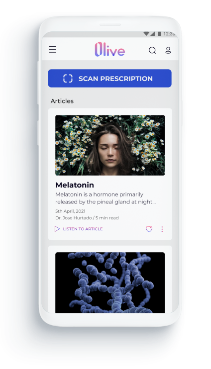
Analyzing doctors' handwriting and reading the prescribed medication
Users have a hard time understanding doctor’s handwriting, to solve this problem, our A.I .model deciphers the doctor’s handwriting when users scan their prescription. After scanning they can read about the medication prescribed or save their prescription.
Reading articles
Users want to read about the medicines before consuming them. Users have become consious of what is going inside their bodies and want to know about the side effects, dosage, interactions, etc. Accessibily to these articles is important to us. Users can listen to articles and change text sizes for better readability.
Multiple profiles and personalization
To make it easier to take care of multiple people for our main user, they can create different profiles. Each profile will have its own dashboard which will give them a quick view of the interactions, saved prescriptions, etc. They will also get personalized notifications on the homescreen.
Design thinking

Empathize and discover
In this phase, I understood the brief, gathered insights from existing products, empathize with the potential users and discover their needs, goals and frustrations.
Competitive analysis
I started my research with understanding the competitors in the medical records and medical knowlege base industry. In particular to get a better understanding of the competitors' strengths and weaknesses, I researched Healthily and Healthline as they are two main players in the medical content for the Indian market. I chose Healthily as it helped me understand personalization and Healthline to understand their knowledge base.
I researched their market position, marketing profile, SWOT analysis, tone of voice. I identified the main features and user flows, and conducted a more in depth UX audit focusing on aspects such as navigation, layout, UI, call to action and differentiation.

User interviews and surveys
Goals
To have a better understanding of user needs and the challenges that they are facing, I conducted surveys and user interviews. I aimed to understand user general behaviours and experiences towards:
- Saving medical records
- Consuming medical content
Key insights from survey
Gathered from the response of 25 people over the period of 4 days via Google forms.
- Most of them (88%) thought it’s necessary to save medical records.
- Only 12% saved medical records in their computer. Most of them (56%) store their medical records in the closet.
- Majority (72%) have tried to find their old medical records. Yet most of them (50%) failed to find their records.
- Almost half of them (44%) go to specific sites like Healthline, WebMD,etc. Whereas half of them (45%) rely on top google searches only.
Affinity mapping from user interviews
I made an Affinity Map to organize all my insights from user interviews and cluster them around the main features of my app. Each session lasted for more than 30 mins. It helped me to prioritize what’s most important and empathize with users on common pain points.

Key insights from interviews
- Users are curious to know about the medicines they consume.
- Users want to understand their medical records in depth.
- Users know the long term benefits of saving medical records digitally but they don’t want to do the work of saving it.
- Users like to read from multiple sources.
Notable quotes
I think it's too much work to save medical records digitally. — Participant 1, data scientist, 30, Ahmedabad, India
I like to read about medicines before taking them. — Participant 2, mother, 27, Ahmedabad, India
User personas
Based on the research conducted during the surveys and interviews, I was able to define my target audience. I created two main personas representing users of my app to be able to better understand their behaviors, needs and goals. This also allows the team to empathize with the users during every phase of the project and design the app features with that in mind.
Anjali wants an organization system for the medical records of her family and Naina is driven by her motivation to read and dive deep into understanding the medicines she wants to take and share her knowlege with family.


Define
In the define phase of the project, I defined the main features of the app which would help our personas to reach their goals.
Defining directions
1. Desiging for a specific circumstance
I decided to design just for precriptions as they can be easily uploaded to the app, storing and organizing them allows for easy access and managing the refills. Additionally, Olive’s knowledge base allows users to read about the medications they are taking and learn what is going on inside their bodies.
2. Giving users immediate benefit
Just helping users to save records is not enough. They can save it in their computer or some cloud storge services. To be more than a filing cabinet and give users immediate benefit, I added a feature that allows users’ to identify the doctors handwriting by using A.I. technology. This will motivate users to scan their precriptions and read about them and eventually save
3. Multiple profiles and personalization
Taking care of multiple people's pills and prescriptions can be quite hard. Users can easily lose track of their pills and interactions. To solve this problem users can create multiple profiles and catalog all relevant information on a dashboard.
MVP
MVP will give me an insight into the functionality of the app or product in the early stages when adjustments are faster and easier. Once it was clear what I wanted to achieve from this project, I listed all the main features and explained why it was necessary to have them.
- Homepage: The homepage will highlight the basic functions of the app like browse articles, scan prescriptions, notifications, navigation and search.
- Login: To use certain functionalities of the app like scan/ save prescriptions and making profiles, the user will need to log in.
- Scan prescriptions: The scan prescription functionality will help users to identify the doctors handwriting. Users will also be able to upload from gallery here.
- Save prescriptions: Saving prescriptions will help users to not lose their prescriptions and keep them organized. Users can shift between grid and list view and it will also have a sort functionality to sort by profiles, date and folder and files. Users can also edit the files, rename and upload images of pills to saved prescription.
- Read articles: Users can read about the drugs they are taking. Users will be able to listen to articles and change text sizes. Users can also report the articles, select if they are intrested in reading about it or not.
- Profile and sub profile pages: Profile page will help keep track of their med lists, saved articles, saved prescriptions and topics they are interested in reading about.
- Notifications: Users will be notified when they run out of pills, when their prescription expires and interactions about the new drugs they enter in.
- Search: Users will need search to find out the articles they are reading about.
- Navigation: Users will need this feature to navigate to different pages of the app.
User journey maps
I tried to create an ideal journey for some particular tasks our users might try to finish. While trying to do so, I tried to forecast any friction point users might face while trying to achieve their goal. This helped me to identify opportunities which will help me to create a better experience for our users.


Ideate
User flows
A user flow lays out the user’s movement throughout the product, mapping out each and every step the user takes—from entry point right through to the final confirmation.
User flows helped me to understand how the users will make decisions to reach their final goals. This process helps us to eliminate steps that are not required and create a flow state for the user to achieve his goal in the most efficient way possible.
Saving prescriptions
Objective
“As someone who has to keep track of whole family’s medical records, I want to keep everyone’s medical records in one place, so that I can always find them when I need them.”
Task analysis
- Homepage
- Onboarding
- Scan/ upload
- Sign up / login to save
- Scan/ Upload- Scan multiple documents and save in existing folder or create new folder or upload from gallery & name/ rename them.
- Documents are saved.
Success criteria
When she uploads all her documents and reads the medical terms.

Reading terms
Objective
“As someone who doesn’t understand the doctors handwriting, I want to know the name of the medicine so that I can search online and read about it.”
Task Analysis
- Homepage
- Onboarding
- Scan / Upload prescriptions
- Tap on the name of the medicine
- Read about the medicine and add to her list.
Success Criteria
When she finds out the name of the medicine and taps on it to read about it.

Information architecture
Information architecture focuses on organizing, structuring, and labeling content in an effective way. The goal is to help users find information easily so that they can complete their tasks.
Sitemap before card sorting
In order to create a bird’s eye view of the entire project, I made a site map based on my conceptual model. I gave them labels and assigned hierarchy.

Card sorting
To test whether my conceptual model matched with the users mental model. I conducted an closed card sorting exercise using Optimal Workshop. Five participants completed the exercise by arranging seventeen cards in seperate categories. The result were as follows:

Insights from Card Sorting Exercize
I assumed users would create a seperate category for saved things, instead the users just wanted the saved articles with articles.
Card sorting helped me build the structure of the website. The navigation and categories became more clear after card sorting was conducted.

Design, test, and iterate
In this phase, I designed various fidelity of designs and tested them with potential users and made new versions based on usability testing.
Wireframing
After having a good idea on the information architecture, I started to sketch out my idea using pen, so I could easily experiment with different layouts and ideas. I focused on highlighting the core features, and created multiple versions of each screen until I found a good combination of features and elements that matched the users needs.
Homepage

Save prescription

User testing
Remote and In-person user testing sessions were conducted with 6 participants. The test focused on four main features:
- Scanning prescriptions
- Saving prescriptions
- Reading articles
- Creating profiles.
Test goals
- To evaluate the ease and learnability of an interface for users.
- To assess how quickly and easily users can complete the tasks and interact with the main features of the application.
- To find out problems that stops the users to finish any particular tasks.
Affinity mapping
I was recording all the sessions conducted on Zoom and in-person. I was also taking notes during the session. To organize all my insights, I used affinity mapping as a tool.

Pain point priority
It is important to structure the findings in a way that your team understands. The rainbow spreadsheet helps to prioritize issues from high to low importance. It gives clarity on which issues to resolve and helps the team to make decisions based on concrete findings.

Design evolution
Based on the rainbow spreadsheet, I started working on the issues. I tried to come up with solutions that will help resolve the issues.
1. Issue: "Can't find med list"
Priority: High
Evidence: 2 users out of 6 had trouble finding the list. Not finding the list will frustate users as they have spent a lot of time in saving it.
Suggested change: Accessing med list directly from profile menu.

2. Issue: Save changes button is confusing
Priority: High
Evidence: 3 users out of 6 were confused with the save changes button.
Suggested change: Changing buttons from 'Save' to 'Login to save' and changing the drop down menu to a clickable option might be a better solution.

3. Issue: Add condition button is confusing
Priority: Medium
Evidence: 4 users out of 6 had trouble understanding what the add condition button means.
Suggested change: Remove the add condition button from the article page and ask the user in the end of the article in detail.

High-fidelity prototype
After resolving the main issues with the mid fidelity prototype, I moved on to create a high fidelity version using Figma. Here I tried to represent my pages as realistically as possible. I made some key decisions about the look and feel of the product. The main goal was to evoke a sense of calmness and appear trustworthy, sincere, and friendly.

Preference testing
I conducted few preference tests to understand what patterns users would prefer. In this case I was curious to know which pattern is the most intuitive for the users to change the text sizes of the article.
The test was done online using Usabilityhub and 13 participants recorded their responses.

Design system and hand-off
In this phase, I focused on structuring the information in a way that will be easy for designers and developers to consume. I also focused on communicating effectively.
Design system
To create a set of reusable components which can be used consistently throughout the app and to hand over the components to the developers design language system were created.
Design system makes collaboration easy between designers and developers and clearly defines all the behaviors, different states of the components, and a visual language which makes it easy to build things in the future.
Design system included guidelines on the usage of logo, typography, colors, navigation, cards, snackbars, imagery, tone of voice, accessibilty guidelines, form fields, buttons, icons, floating action button, responsive grids, etc.

Developer handoff
The relationship between designers and developers is crucial. From the start to finish I would constantly be in touch with them. They will be part of the sprint reviews.
I will ask them various questions about the frameworks and technical constraints I should be aware off before designing.
I will use Zeplin to hand off the finalized screens. I will make detailed notes to explain how particular interactions work.

Learnings
Structure and Organization: I learned that everything you do as a UX designer needs to be structured in a way that is easy for others to consume. When there is structure it is easy to collaborate and communicate with other. In this project, I learned how to apply structure to all aspects of my design process. eg) Affinity mapping, Personas, Design System, findings from Usability tests, designing wireframes.
Setting Goals: What is the purpose of doing any activity should be defined, only then we can lead in the right direction or we may get lost.
User at the centre: Ask, Observe and Test with users at all different stages in your design process. Their input will be the most valuable.
Next steps
Design for different types of records: Eventually we would want users to scan all types of medical records. They will be able to read about all the difficult medical terms they have trouble understanding.
Design for a multiple languages: This might affect my current design system. A strong Translation Management System like Phrase might be helpful.
Design for Errors: What will happen when the A.I algorithm suggests something that is not accurate? The user should be able to report this.